Spring is an eco-friendly company working to change how people use and consume technology,
especially mobile devices. Rather than wasting old devices, Spring has created ‘Spring pods’ to simplify
the process of selling electronic goods. The public launch took place in Autumn 2021.
especially mobile devices. Rather than wasting old devices, Spring has created ‘Spring pods’ to simplify
the process of selling electronic goods. The public launch took place in Autumn 2021.
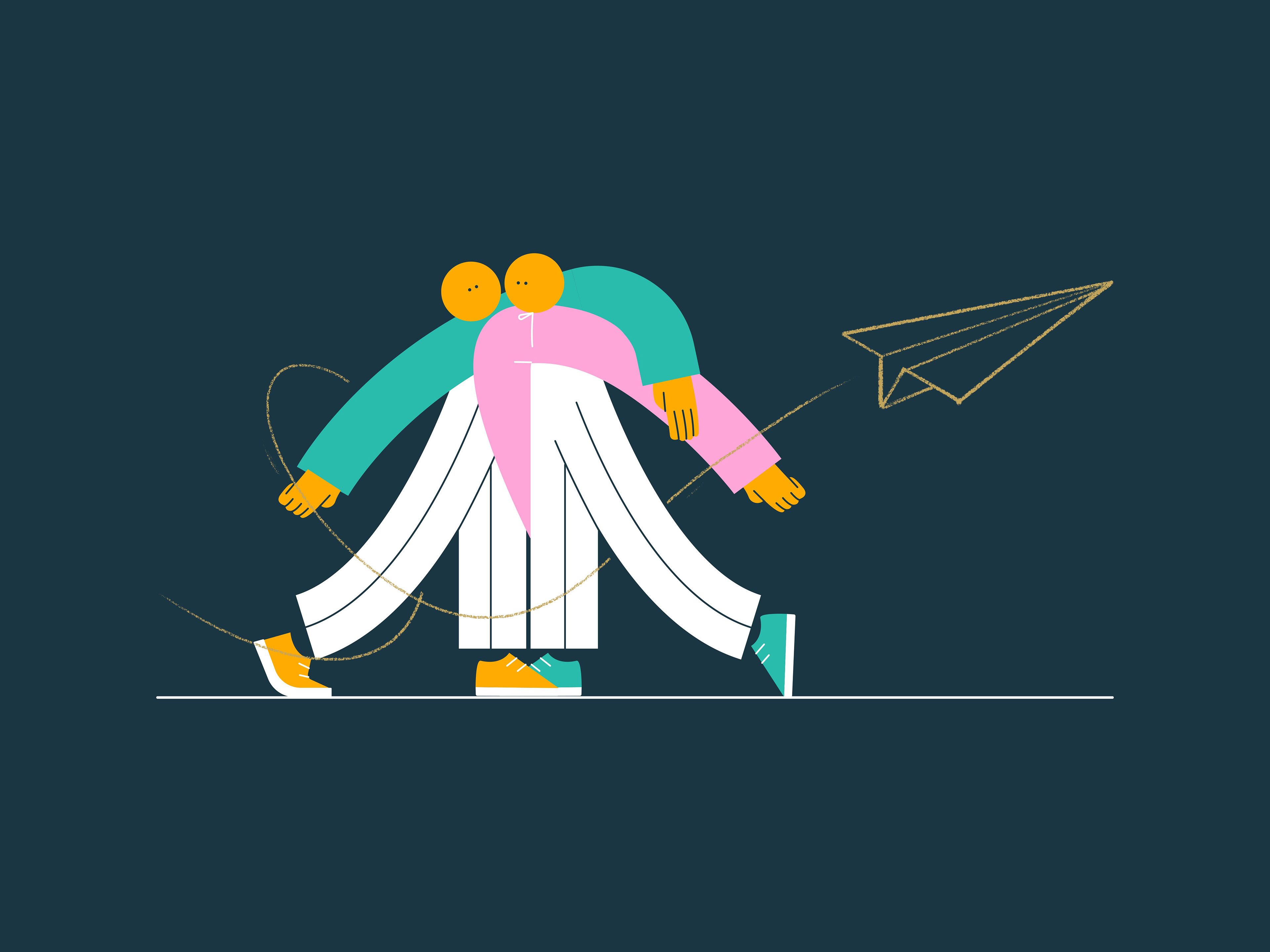
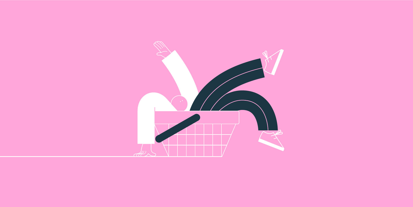
During Summer 2020, I started working on a new illustration branding identity for Spring.
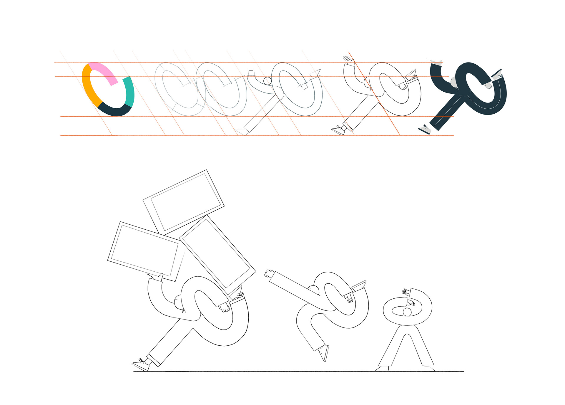
Inspired by the shape of their logo, the character I created came directly from the logo’s spiral form.
The figure, simply built of two lines, moves easily between different actions because
of its geometric shape, this creates consistency while retaining a bold look.
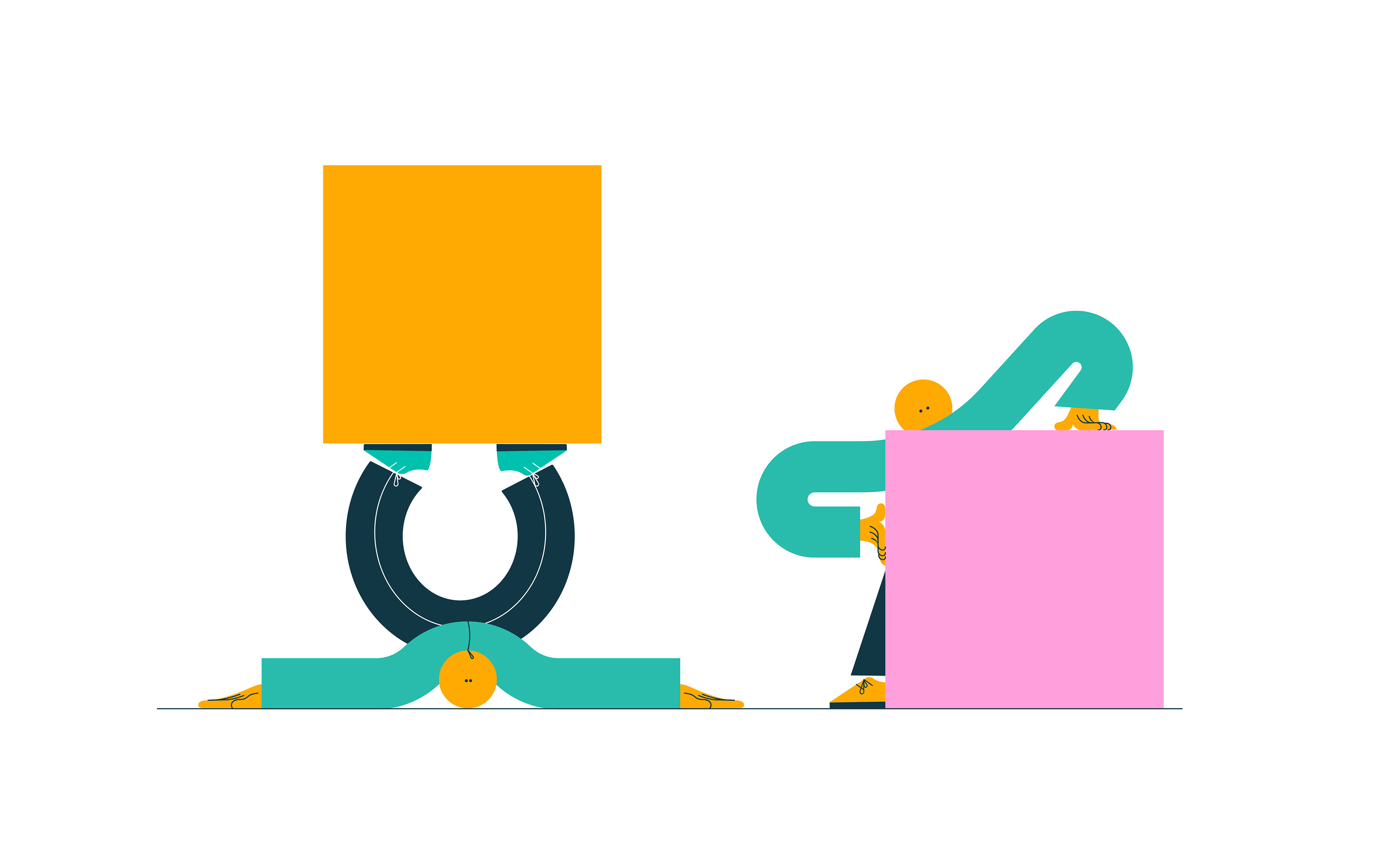
The character embodies Spring’s key qualities, dynamic, fresh and approachable.
Inspired by the shape of their logo, the character I created came directly from the logo’s spiral form.
The figure, simply built of two lines, moves easily between different actions because
of its geometric shape, this creates consistency while retaining a bold look.
The character embodies Spring’s key qualities, dynamic, fresh and approachable.
Homepage of their website
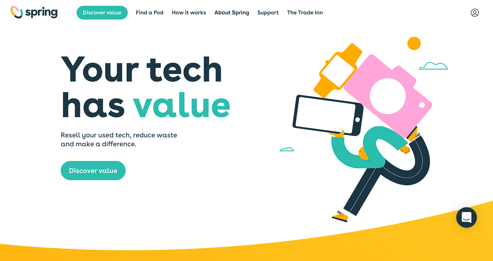
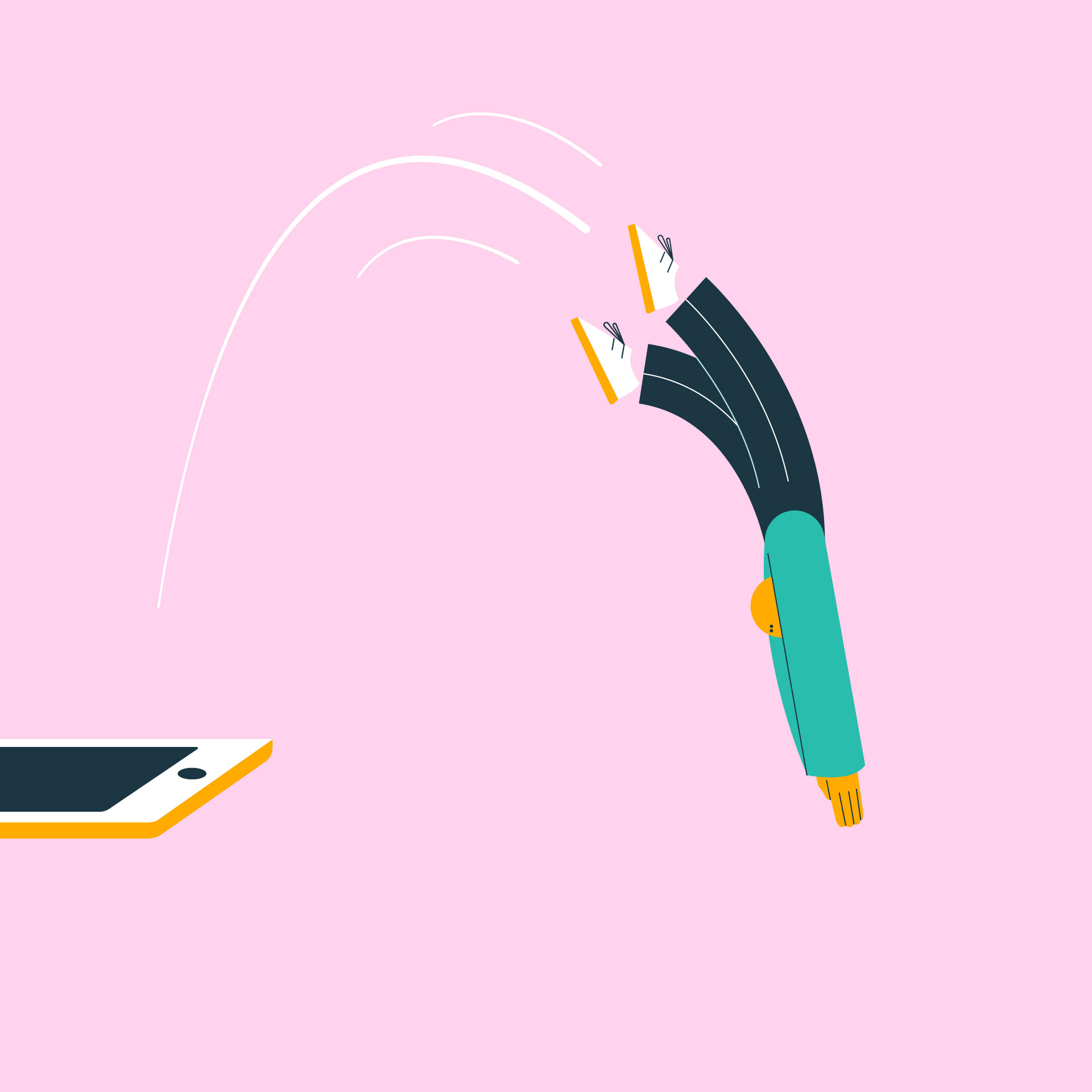
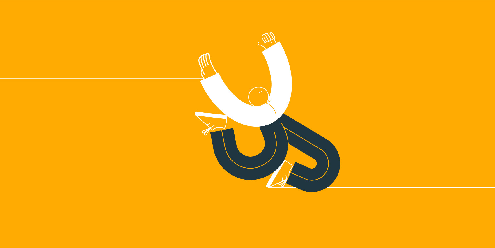
Once the character design was approved, I did all the assets for the website.


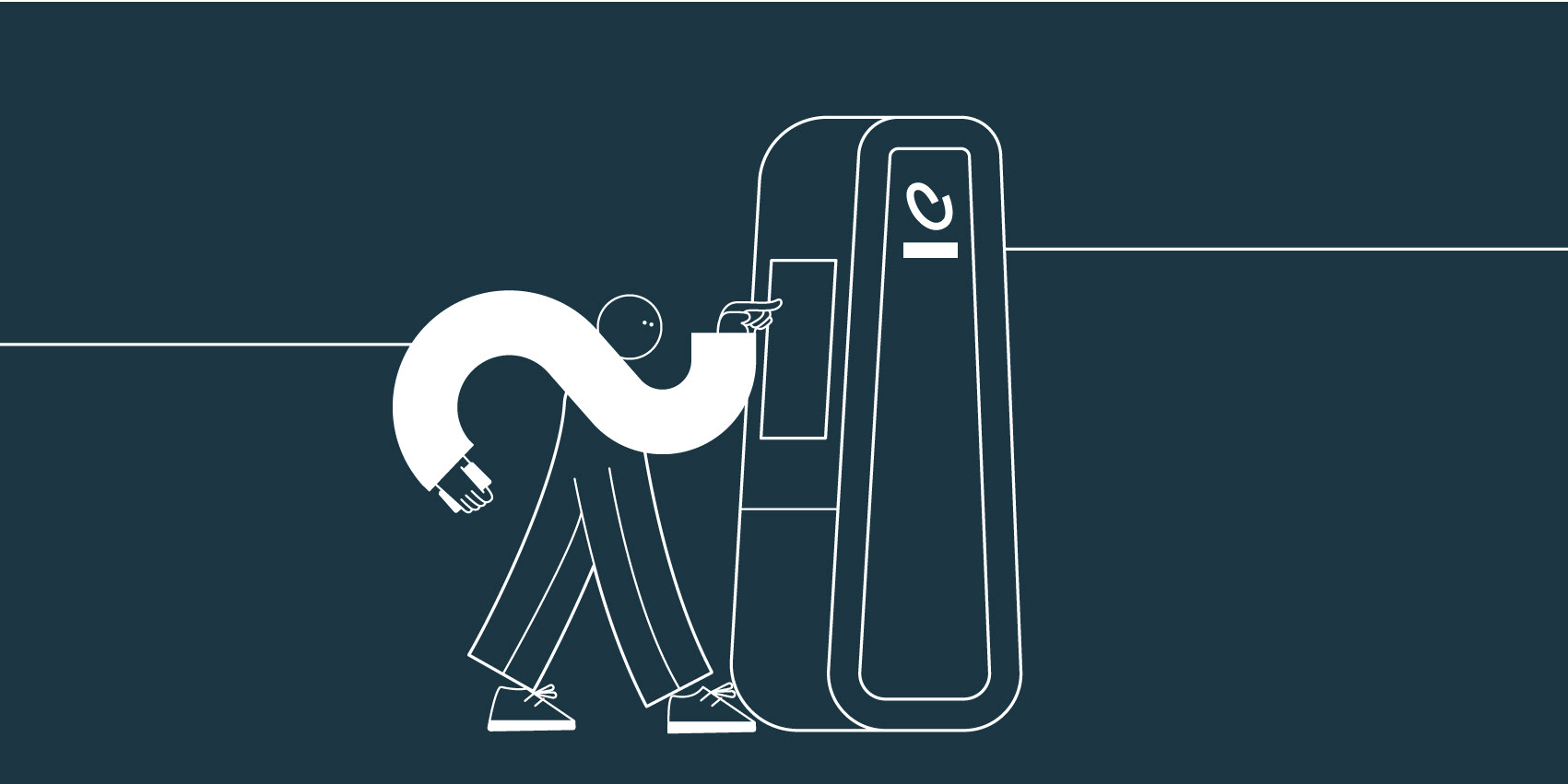
Running cycle created for Pod's screen on hold

Animated logo research and final loop :


Design made for the launch promo film, animation made by Studio Gundar.

•
Client : Spring
Year : 2020
Role : Illustrator
Client : Spring
Year : 2020
Role : Illustrator